


When a consumer scans a product, what should its Digital Product Passport (DPP) look like? A new report from the CIRPASS-2 consortium examines this question. It compares four possible designs and recommends one: the consumer first sees the brand's own product page, and the information required by EU rules is one click away.
The report was published on 10 July 2026. It was added to the EU's Transition Pathways platform for textiles on 24 September 2026.
This article explains the four design options, which one the report recommends, and the report's 10 recommendations.
The report is titled UI/UX Visual Identity Options for Digital Product Passports (version 1.0). Its 21 authors come from organisations including Avery Dennison, Kezzler, IOXIO, Fujitsu, Michelin, GS1, TNO and Fraunhofer IZM.
The report deals only with what consumers see. It covers public DPP information that needs no login, whether the consumer opens it with a phone camera, an NFC tag, an app or a link on a shopping website.
The report is not an official EU position. The authors state that the views are their own and do not necessarily reflect those of the European Union.
EU rules set out what information a DPP must contain. They do not say how that information should look on screen. The authors argue that the design will decide whether consumers use the passport at all.
The report gives two examples. The report notes that only 13% of Italian consumers have ever scanned the QR code on the EU energy label (p. 7). Consumers also rarely scan the QR codes on wine bottles that link to ingredient and nutrition details.
The authors conclude that putting information online does not mean people will use it. A DPP is also meant to connect owners to repair, spare parts, resale and recycling services, so it needs to be useful every time someone scans it.
The report compares four designs. Each one gives a different answer to two questions:
The authors say that many other designs and combinations are possible, but they chose these four as the main ones to analyse.
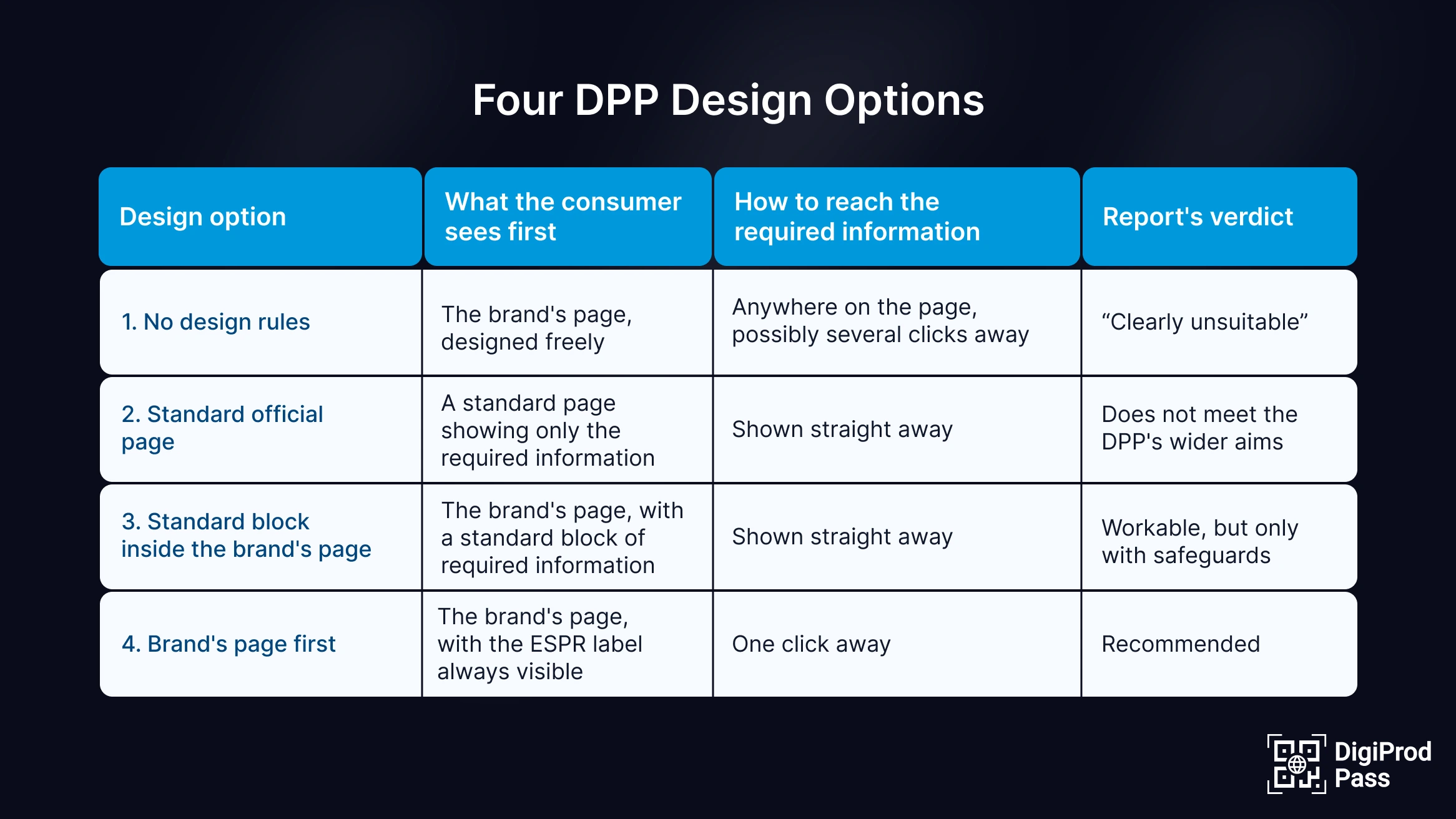
Option 1: No design rules
How it works: Brands design the DPP page however they like, as long as the required information is available somewhere. This is the current position under EU rules.
Main problem: Pages would look different for every product, products would be harder to compare, and brands could push the required information out of view.
Verdict: The report calls this option "clearly unsuitable".
How it works: Every scan opens a standard page that shows only the required information, in the same layout for every product. The model is the EU energy label database (EPREL). The page can include an optional link to the brand's own page.
Main benefit: Products are easy to compare.
Main problem: The report expects fewer people to scan, because the page offers little beyond compliance information.
Verdict: It does not meet the wider aims of the DPP.
How it works: The brand designs the page, and a standard block containing the required information sits inside it. The block looks the same across all products, and consumers can minimise it.
Main benefit: The required information is visible straight away.
Main problems: Many consumers may find the full block too much information. Brands have little room to stand out visually, and brand content could still overshadow the required information.
Verdict: A balanced approach, but only with safeguards, such as a clear visual separation between the required information and the brand's own content.
How it works: The scan opens the brand's page. This can be a new page or an existing product page. The ESPR label is always visible, and a link opens the full required information in one click. Some required information, such as ecodesign scores, can also appear on the brand's page itself.
Main benefit: The report argues that consumers are more likely to keep scanning if the first page offers useful content and services, such as repair and resale.
Safeguard: Rules could control how the link to the required information is designed and where it is placed.
Verdict: This is the option the report recommends.
The report ends with 10 recommendations. These are separate from the four design options. Recommendation 1 chooses the design. Recommendations 2 to 10 cover other steps the authors believe are needed.
No recommendations have been adopted yet, but companies preparing their DPPs can already use the report's findings to plan pages consumers will want to scan and return to.
What is the CIRPASS-2 DPP UI/UX report?
It is a July 2026 report by the CIRPASS-2 consortium that compares four ways a Digital Product Passport could be shown to consumers. It was added to the EU's Transition Pathways platform for textiles on 24 September 2026.
Which design option does the report recommend?
Option 4. The consumer first sees the brand's page with the ESPR label visible, and the full required information is one click away.
What is the difference between the design options and the recommendations?
The four design options are possible ways a DPP could look. The 10 recommendations are the report's conclusions. Recommendation 1 chooses Option 4. The other nine cover accessibility, consistency, testing and consumer awareness.
Do EU rules say how a DPP must look?
No. EU rules set out what information a DPP must contain, but not how it should be displayed.
Is the CIRPASS-2 report an official EU decision?
No. The authors state that the views are their own and do not necessarily reflect those of the European Union.
Will DPP pages have to be accessible?
The report recommends making accessibility standards such as EN 301 549 mandatory for DPP pages. This is only a recommendation and has not been adopted.